Repository navigation
Conversation


e3dbfe2 to
1a21a65
Compare

|
"All checks have failed". |
 jensmaurer
added
the
needs rebase
|
@jensmaurer That's due to |

7b6a708 to
fc8103f
Compare
|
I rebased and quelled the overfull line warnings with the use of |
jensmaurer
removed
the
needs rebase
zygoloid
added
the
decision-required

|
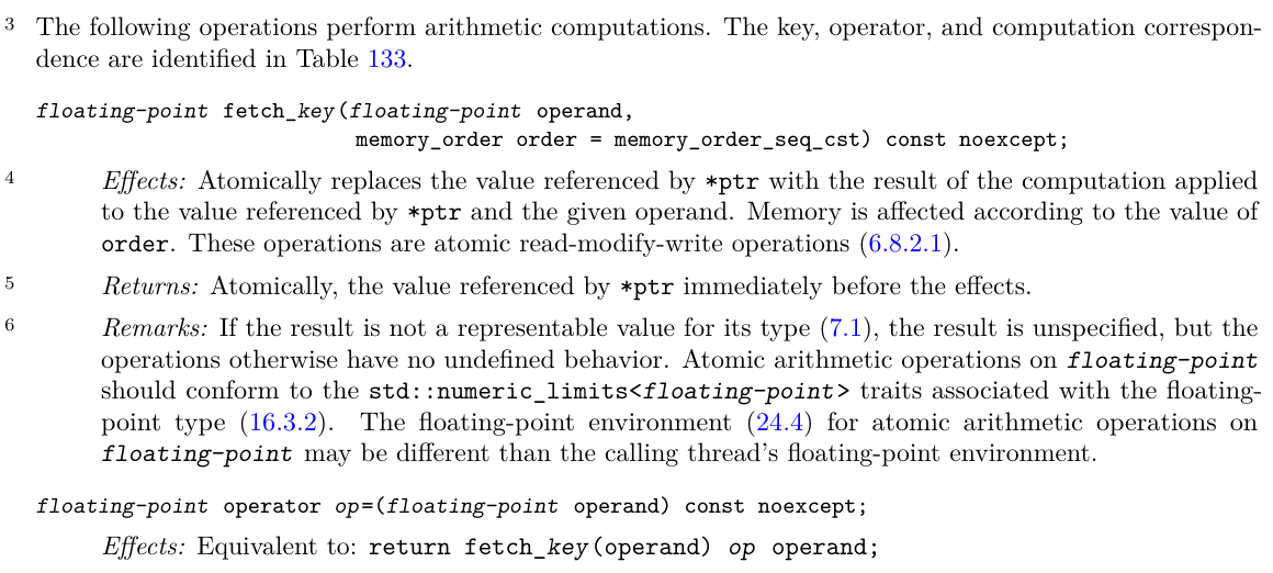
(In the diffs, the cyan is the new formatting and the red is the current formatting.) Initial reaction: I think I somewhat prefer the current formatting for teletype placeholders. Use of a different typeface makes the placeholders stand out more clearly; the difference between slanted and unslanted teletype is easier to overlook, precisely because it's more visually consistent (which I think is the goal here). Let's discuss this in person. We should also consider how to format things like |
|
Editorial meeting:
|
jensmaurer
removed
the
decision-required
|
Before:
After:
I think this confirms:
(The difference between the slanted and non-slanted text has become too subtle.) |

 zygoloid
added
changes requested


|
Are we still planning to land some part of this PR? Should we consider closing? It has been (mostly) dormant for almost 5 years now. |


This PR demonstrates an option outlined in issue #1060: a smarter
\placeholdermacro that typesets the placeholder either italics or slanted depending on whether it's code or roman text.A diff of the PDFs is available here. A sample of pages that differ include 29, 30, 433–435, 880–890.