Repository navigation
feat(vscode): combine agent, model, and reasoning into one prompt control - #14927
Conversation


|
I love it and there's only one obvious thing I would improve, accordingly with current screenshots and gifs, the outline for both first and last buttons in the group is "squared" instead of preserving the left or right rounded corners. Everything else feels intuitive, better, more elegant and a11y friendly so ... I'd approve, but I would pay attention to agents and variant outline, no other issues for my eyes + thank you for this effort. |

|
I think the outline was fixed already, this might just be a gif artifact or from before the fix. Can you reproduce that in the build? |

|
@marius-kilocode I think this is a huge improvement 💪 The one thing I'm not fully aligned on is the narrowing and widening of the prompt. I don't see how it fits with the fixed-length aspect of the entire extension. In any case, thanks for putting in the work here! Will run a review agent and post any findings. |
|
@brunoagatao 'narrowing and widening of the prompt'. Can you explain this a bit further? |

| // The new popover takes focus, so the open one closes as an outside focus. | ||
| // Wait one frame so the hover tooltip has opened first. Opening the popover | ||
| // then closes it, the same as a click does. | ||
| requestAnimationFrame(() => { |

There was a problem hiding this comment.
SUGGESTION: This is the only requestAnimationFrame in the file that is not tracked and cancelled on cleanup (state.frame is stored and cancelAnimationFramed in the onCleanup below). If the open popover closes during the one-frame delay — or the component unmounts — this callback still runs; the guard only re-checks :hover and data-expanded, not the “another picker is open” precondition verified on line 124. Consider capturing the handle, cancelling it in onCleanup, and re-checking that a trigger is still expanded before calling target.click().
Reply with @kilocode-bot fix it to have Kilo Code address this issue.
| position: absolute; | ||
| top: 6px; | ||
| bottom: 6px; | ||
| left: 0; |
There was a problem hiding this comment.
SUGGESTION: In RTL locales the webview sets dir="rtl" (webview-ui/src/context/language.tsx:133), which reverses this flex row. This ::before marks the boundary before a segment, so in RTL it belongs on that segment's inline-start (right) edge; left: 0 instead draws it on the inline-end edge, so the agent/model separator disappears and a stray separator appears at the group's outer edge. Using the logical inset fixes it.
| left: 0; | |
| inset-inline-start: 0; |
Reply with @kilocode-bot fix it to have Kilo Code address this issue.

Code Review SummaryStatus: 2 Issues Found | Recommendation: Address before merge Overview
Issue Details (click to expand)SUGGESTION
Files Reviewed (9 files)
Fix these issues in Kilo Cloud Previous Review Summary (commit c64d0e8)Current summary above is authoritative. Previous snapshots are kept for context only. Previous review (commit c64d0e8)Status: 2 Issues Found | Recommendation: Address before merge Overview
Issue Details (click to expand)SUGGESTION
Files Reviewed (11 files + i18n)
Reviewed by deepseek-v4.1-flash · Input: 82.9K · Output: 31.9K · Cached: 2.4M Review guidance: REVIEW.md from base branch |
|
@marius-kilocode I'm referring to this feature |
|
Review notes (Medium findings). No High issues found. 1. Long agent names are not truncated ( 2. Folded actions lose state and feedback (
Fix: set 3. Fold uses hard-coded widths ( Also relevant to Cursor (same Chromium webview): items 1 and 3 can show in any host, most likely in a narrow or secondary side bar. |
|
I believe both @kilocode-bot suggestions are valid and, if the outline for agents/variants is already fixed, I would approve - still I think Bruno has a point but I also think that was just to show how the current logic would scale in more constrained horizontal spaces, so if that's the case, I would still approve, otherwise I don't think it should be "resize-able". |
|
Going by the PR description, the narrowing and widening GIF only shows how the toolbar folds at different sidebar widths. It doesn't add a resizable prompt. The width comes from the VS Code sidebar, and the toolbar stays on one row at any width. Marius or Bruno should confirm that. Do you want me to fix the two review suggestions on this PR? They are:
I could also cover Bruno's medium findings. They are long agent names not truncating, folded actions losing their state and feedback, and the hard-coded fold widths. Tell me which of these to include. I'll push the changes to the existing PR branch. |
|
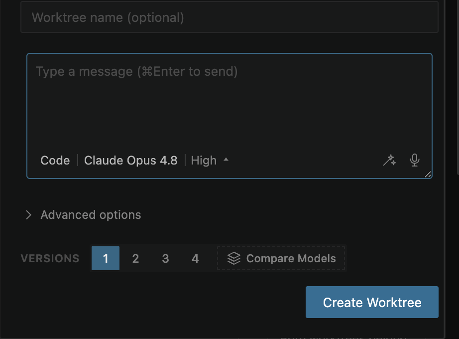
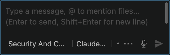
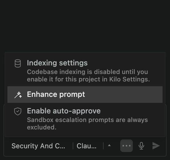
Pushed f7c9034 with the review fixes and the New Worktree dialog. New Worktree dialog now uses the same split control. Long agent names truncate with an ellipsis. The agent is capped at 10em and shrinks much slower than the model, so the model gives up room first (down to 6em) and short names like "Code" stay readable. A label cut by the cap no longer counts as missing room, so reasoning still shows when there is space. Folded actions keep their state. Menu items show the old tooltip text as a description (indexing status, sandbox unavailable reason, auto-approve sandbox note), indexing keeps its tone color, enhance shows a spinner while it runs, and the dot on the menu button takes the most important state (error, then warning, then an enabled toggle). The menu now fits the sidebar width. Fold sizes come from the DOM. Slot width, toolbar padding and gaps are measured, and the reserve is 19em of the toolbar font, so it scales with the font size setting. The reasoning cap uses the same reserve, which removed the extra margin constant. A 4px sweep at font size 18 showed each change once per direction with a constant prompt height. Also fixed: the hover switch frame is now tracked, cancelled on unmount, and checks again that another picker is open. Separators, outer corners and fold margins use logical properties, so RTL renders correctly: One thing I left as it is: in the New Worktree dialog, Escape after a hover switch moves focus to the document body. The base selectors handle focus there, and a plain click already restores focus somewhere else, so this is separate from this change. |



| } | ||
|
|
||
| .prompt-more-button[data-busy]::after { | ||
| animation: prompt-more-pulse 1200ms ease-in-out infinite; |
There was a problem hiding this comment.
SUGGESTION: The new busy-state pulse is not disabled under reduced motion.
.prompt-more-button lives inside .prompt-input-hint-actions, and the animated ::after is a descendant of .prompt-action. The reduced-motion guards at lines 740-756 only target .prompt-selectors, .prompt-selectors *, and .prompt-action itself (not .prompt-action * / .prompt-action *::before), and body.vscode-reduce-motion .prompt-action { animation: none !important } does not cascade to a descendant pseudo-element. So this pulse keeps running while the user has reduced motion enabled, even though the PR states reduced motion is handled. Consider adding .prompt-more-button::after (or .prompt-action *::after) to both reduced-motion blocks.
Reply with @kilocode-bot fix it to have Kilo Code address this issue.
|
|
||
| /** Space kept for the selector control. It scales with the toolbar font size. */ | ||
| export function reserve(el: Element) { | ||
| return RESERVE_EM * (parseFloat(getComputedStyle(el).fontSize) || 11) |
There was a problem hiding this comment.
SUGGESTION: reserve() reads a fixed pixel token, so it never scales in the webview.
.prompt-input-hint sets font-size: var(--kilo-font-size-11), and that token is the literal 11px (packages/kilo-ui/src/styles/globals.css:12); the icon-button slot used by the fold math is likewise fixed (width: 22px). getComputedStyle(hint).fontSize therefore always returns 11px, so reserve is always 209 and slot always 26 — the fold steps never change with font size. The comment ("a larger font scales the fold steps") and the new "scales with a larger font" case in tests/unit/prompt-fold.test.ts:28 inject synthetic reserve/slot values the DOM never produces. Either drive the toolbar font from the scalable root token (calc(var(--vscode-font-size) * var(--kilo-font-scale))) so this actually scales, or drop the test/comment so it does not imply coverage that does not exist.
Reply with @kilocode-bot fix it to have Kilo Code address this issue.


What Problem This Solves
The prompt toolbar showed agent, model, and reasoning as three separate bordered buttons that wrap onto new rows in narrow sidebars. On a 297px sidebar the toolbar grew to three rows and the prompt box went from 92px to 148px tall, and the height changed again whenever a pick changed a label length. The unset reasoning value showed as "Default", which does not explain what it controls. The action icons on the right never adapted to width.
Why This Change Was Made
Agent, model, and reasoning describe one thing: how the next message runs. They now render as one split control in the chat prompt and the New Worktree dialog, styled like the Agent Manager terminal split button: flush ghost segments, rounded outer corners only, and a fill on the hovered segment. Short separators and one trailing arrow make the parts read as controls at rest.
Each segment is still the existing
ModeSwitcher,ModelSelector, andThinkingSelector, so popovers, slash commands (/agents,/models,/variant),Cmd+./Cmd+Shift+.,Shift+Tab, and focus restore use the same code paths as before. Popovers still open instantly; motion is limited to the control itself.Layout rules, in priority order:
Shift+Tab) peeks out for about 1.5 s, the tooltip names the value ("Reasoning effort: High"), and the picker has a "Reasoning effort" heading.Interaction additions: while one picker is open, hovering another segment switches to it (menu bar behavior), and Left/Right arrows move between segments. Reduced motion and high contrast themes are handled.
User Impact
Evidence
Hovering between segments while a picker is open:
Resizing the sidebar. The prompt itself is not resizable; the recording narrows the prompt box to simulate dragging the VS Code sidebar edge, which the test harness cannot do. Actions fold one step at a time, the reasoning label collapses first, and the toolbar stays one row:
Narrow sidebar shortcuts.
Shift+Tabbriefly reveals the new level,Cmd+.animates the agent label:More actions menu with a folded toggle that is on (the square blue boxes in the GIFs are the recorder's pointer markers, not the UI focus ring):
Keyboard focus follows the segment shape: the first and last parts keep the outer rounded corners, inner edges stay square.
Verified in an isolated VS Code instance: hover switching in all directions, Escape and focus restore, arrow keys,
Shift+Tab,Cmd+.,Cmd+Shift+., the three slash commands, and the More actions menu toggles. A width sweep from 460px to 240px and back in 4px steps showed each change exactly once per direction with a constant 92px prompt height.prompt-foldhas focused unit tests. The Agent Manager New Worktree dialog uses the same control through the sharedPromptSelectorsshell.